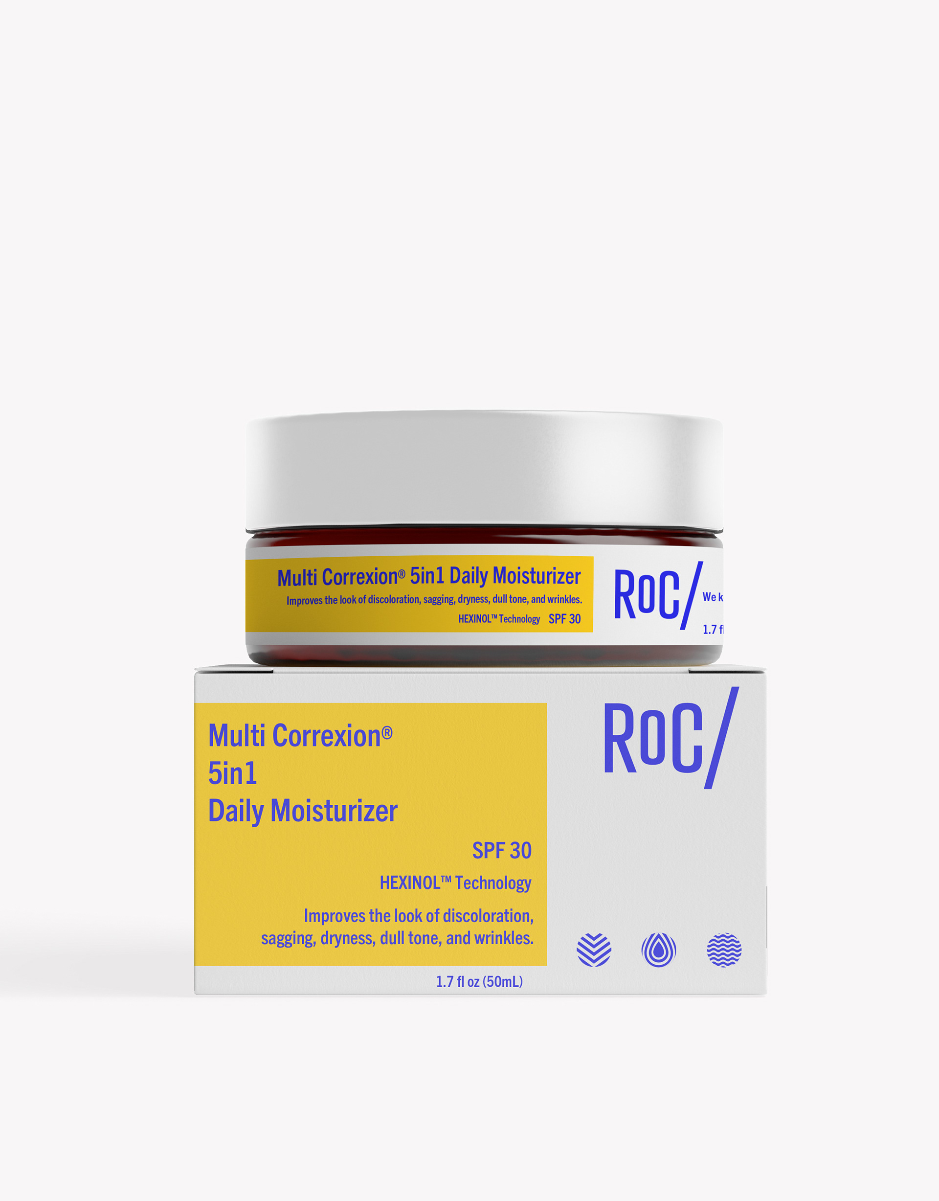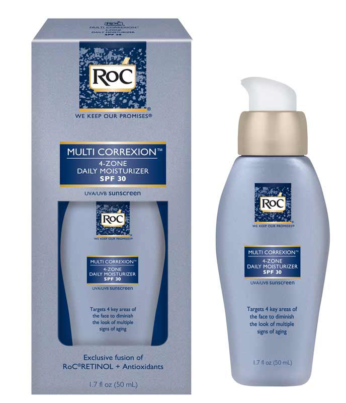

A side by side comparison of the new branding (as seen on the left) with the current branding (as seen on the right)
A rebrand concept I did of RoC skincare. RoC has been a staple in thousands of women's cabinets for decades, but the branding has done little evolving over the years, so I decided to take a crack at what a more modern and vibrant version of the branding could look like. I took the original yellow (gold) and blue and created a more saturated and vibrant color palette from those and then worked on the logo and how to make it more modern, yet hold the original character. I wanted this to jump off the shelf and make the consumer excited to buy this, whether they are a repeat customer or a new one. While also keeping the medicinal feel that we all know and trust.

